
These days “machine learning” is a common phrase across a wide range of industries. The need to manage, analyse and report on large scale datasets is no longer restricted to tech companies - sectors from retail to manufacturing to healthcare rely on data scientists to make sense of the huge volumes of data gathered in the execution of their business, and attempt to use it to plan for the future, optimise processes and predict risks and opportunities.
Now though, the same smart technology which allows specialists to manipulate these datasets has evolved to simplify the process of interacting with those same tools. This has lowered the barrier to entry in terms of data processing and analysis, allowing non-specialists to deploy machine learning to make predictions and identify patterns in their data.
An excellent example of such an implementation is Smart Predict, part of SAP Analytics Cloud, which combines a user friendly interface with prewritten algorithms to allow anyone to take on the role of data scientist within their organisations.
Let’s take a more detailed look at how Smart Predict works:
Creating a predictive model in SAP Analytics Cloud
Within SAP Analytics Cloud there are three distinct types of “Predictive Scenarios”. Each is suited to a slightly different task, and requires different inputs.
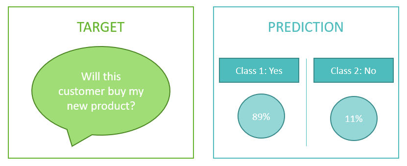
A. Classification: Used to predict the value of a target. SAP Analytics Cloud returns a percentage probability of each of two outcomes occurring.
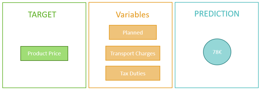
B. Regression: Used to predict the numerical value of a target depending on a selection of variables describing it. SAP Analytics Cloud returns a numerical value.
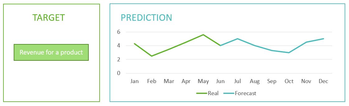
C. Time Series: Used to forecast numerical values over a specified time period, based on existing data. SAP Analytics Cloud returns a series of values which can be graphed.
Training the predictive model
In order to create a Predictive Scenario we need to train the model using an existing dataset, either a training or application dataset. The output will create a third dataset.
Training Dataset: Input dataset that we use to generate our predictive model, containing historical data on the value that we want to predict. The target variable is the column related to our business question.
Application Dataset: Used to create predictions with current or new data. The values for the target variable are unknown.
Output Dataset: Contains our predictions and any added columns that we have requested.
When we train the model, the tool splits our dataset into two subsets. It generates predictive models using the first one, and applies each version of the predictive model to test the accuracy and robustness against the second one. The best performing version is the selected predictive model.
After this comes a debriefing stage where the selected predictive model is evaluated to decide if the model is ready for use or not. At this point, we have the option to apply the model, improve it or create a new one from scratch.
Variables
To be able to create a Predictive Scenario we require various parameters, or variables. Variables are the column values in our dataset, and depending on the Predictive Scenario, different types of variable will be involved, for example:
Target Variable: The answer to our question (the variable we are trying to generate). It is used in all Predictive Scenarios, but in Time Series it is called the Signal Variable.
Date Variable: Time Dimension. Mandatory for Time Series Predictive Scenario.
Segmented Variable: To divide our data and the prediction into subsections, for example by product category. This variable is only used in Time Series Predictive Scenarios and is optional.
Excluded Variable: Data to ignore in the predictive model. It is an optional variable and can be used in all the Predictive Scenarios.
Influencer Variable: Other data that will be used to explain the target variable. It is an optional variable and can be used in all the Predictive Scenarios.
It is important not to confuse variables and roles. The difference is that variables are the column values of our dataset, and roles are assigned variables used to create a predictive model.
Assessing the precision of our model
Once the model has been created, we can see a set of parameters that helps us to assess the accuracy of the predictive model. Let's look at some examples, and how we can analyse them to determine the success of our model.
Time series scenario
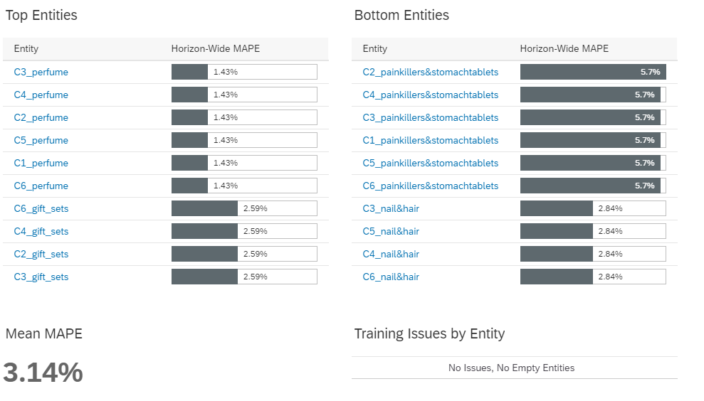
In this example we are attempting to forecast the sales of assorted products and we will segment the forecast by product categories. The most important measure that we must consider is the MAPE (Mean Absolute Percentage Error). This is the probability of error of the future sales predicted by that model.
In the screenshot below we can see the MAPE of each product category, on the left side the lowest values and on the right side the highest ones. Finally, at the bottom, we can see the mean MAPE of the model.
We can also see the factors that the predictive model has considered. In the following example we can see our Actual, the forecast values, “outliers” that are points very distinct from the standard deviation, and finally, the dashed line, representing the error zone of the predicted value with maximum and minimum values.
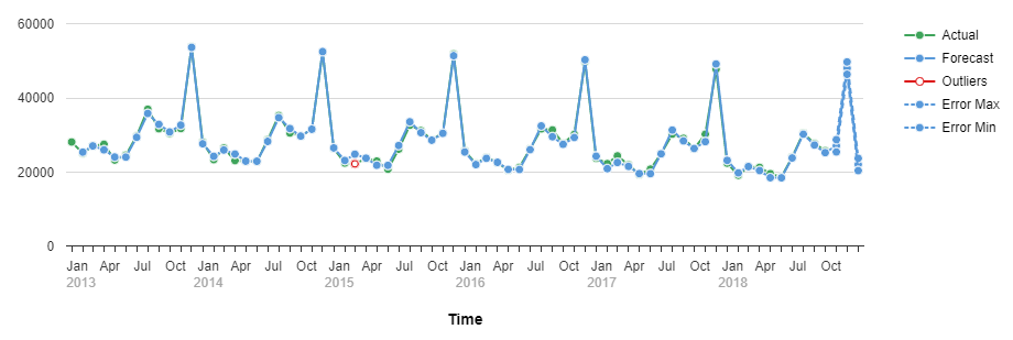
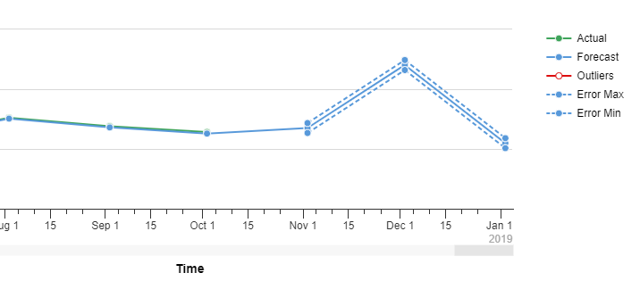
In reality, the predictive model would give us many more charts to analyse, but with these basic concepts we can see how the accuracy of our Time Series Prediction is measurable.
Classification scenario
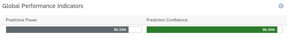
In this example, we will classify customers that may be lost by the business. There are two important values to look at. The first one is the Predictive Power (KI), which is the proportion of information that our model can explain, and gives the percentage of how close our model is to perfection. The second one is the Prediction Confidence (KR), it shows the robustness, which is the success rate of our model in identifying future customer losses.
In the following image we can see the KI and KR of our model, showing that both are relatively high, which is good news!
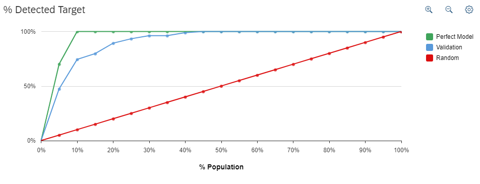
Another interesting view of the accuracy of our model can be seen in the chart below, where we compare the model’s performance (blue line) to both random chance (red) and a perfect model where all losses are detected (green). As we can see, in this instance our model tracks the perfect model extremely closely, indicating a high degree of accuracy.
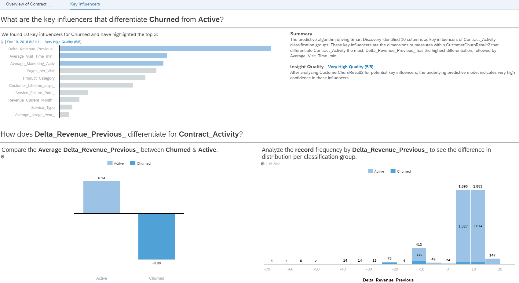
We can also see, for example, a chart of all variables that the model generation process found to be relevant and sort them by the strength of their effect on the customer losses.
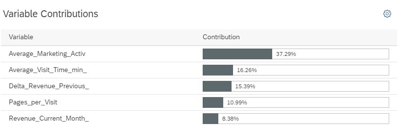
As in the earlier example, the predictive model would give us many more charts but here we have summarized the most basic illustration of the model.
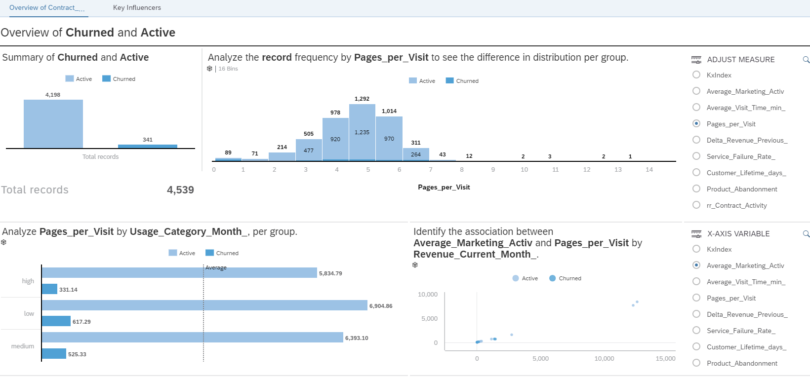
Analysing and reporting on the results
The last step in the process is analysing the final prediction results. SAP Analytics Cloud makes this easy via an option called “Smart Discovery” with which we can explore our data using Machine Learning algorithms to discover key influencers, unexpected values and more.
When we create the smart discovery story with the Classification model explained above, the tool automatically generates two pages of information: one that gives an overview and one showing the key influencers of the model.
Just by pressing a button we have a dashboard, this is a good starting point. Also, the dashboard created is interactive, on the right we can see an input selection, this selector has the function to change the measure displayed in the charts, so, we can see different indicators in the same view: the influence, distribution etc. for the churners and active customers.
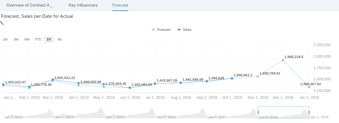
As SAP Analytics Cloud is also a self-service BI (Business Intelligence) tool, we can adjust the layout of the report, adding further visualization either on the existing pages or on a new page. For example, we can add a new page with a forecast chart of the sales in our store achieved from our Time Series model explained above.
As we can see from the examples we explored in this article, the key business advantage of Smart Predict is that users of SAP Analytics Cloud are able to generate predictions quickly and easily, through a point and click interface, as well as clearly understanding the accuracy of the output, without the need to assign the task to a specialist.
The prewritten algorithms within Smart Predict are useful for hundreds of possible applications, allowing managers and executives to quickly analyse datasets to predict future performance and aid decision making or forecasting, with a vastly reduced admin overhead.
While this technology does not replace the expertise of a qualified data scientist in all scenarios, for common types of forecasting and modelling it represents a breakthrough in removing the barrier to entry for utilizing machine learning.
If you’d like to learn more about how Smart Predict could revolutionize access to machine learning and predictive models within your organisation, the team at Clariba would be happy to demonstrate.